
Newspaper websites display fewer stories, more curation
Read this article for free:
or
Already have an account? Log in here »
To continue reading, please subscribe:
Monthly Digital Subscription
$1 per week for 24 weeks*
- Enjoy unlimited reading on winnipegfreepress.com
- Read the E-Edition, our digital replica newspaper
- Access News Break, our award-winning app
- Play interactive puzzles
*Billed as $4.00 plus GST every four weeks. After 24 weeks, price increases to the regular rate of $19.95 plus GST every four weeks. Offer available to new and qualified returning subscribers only. Cancel any time.
Monthly Digital Subscription
$4.99/week*
- Enjoy unlimited reading on winnipegfreepress.com
- Read the E-Edition, our digital replica newspaper
- Access News Break, our award-winning app
- Play interactive puzzles
*Billed as $19.95 plus GST every four weeks. Cancel any time.
To continue reading, please subscribe:
Add Free Press access to your Brandon Sun subscription for only an additional
$1 for the first 4 weeks*
- Enjoy unlimited reading on winnipegfreepress.com
- Read the E-Edition, our digital replica newspaper
- Access News Break, our award-winning app
- Play interactive puzzles
*Your next Brandon Sun subscription payment will increase by $1.00 and you will be charged $17.95 plus GST for four weeks. After four weeks, your payment will increase to $24.95 plus GST every four weeks.
Read unlimited articles for free today:
or
Already have an account? Log in here »
I focused more on the presentation of content on the main homepage rather than navigation etc.
A couple of broader notes:
- On most sites, fewer stories are featured “above the fold” than we use. Our site displays one major top story, then a dozen more “top stories.” On the sites I reviewed, most show 5-10 major stories before the design shifts to smaller presentation of subsections/featured/popular.
- A fair bit of our front-page real estate is taken up with non-editorial content: homes for sale, obits, FP Features, repeated weather. Our top-level navigation has non-news elements like FP Features, Media Kit, Classifieds.The homepages on the sites I reviewed display almost exclusively editorial content, which makes sense because that is what the users are there for. Perhaps we can move elements like the FP Features/Homes/Passages box to article pages, where they would still be presented to the user but wouldn’t take up homepage space.
- On our site, because our site sections cannot really “see” each other, users often see duplicate stories on the homepage — like they see the same story in Top News and in a lower subsection. Other news sites do not see this.
I’d also like to do a deeper dive on article page design — since many users enter our site via social media, newsletters and sharing, the article page may be the first page they see. So we should ensure it should offer elements that lead readers to explore the site further.
Here are a few site screenshots with notes on presentation:
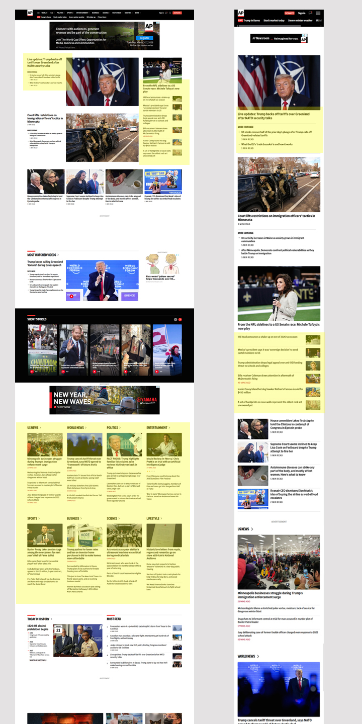
AP News: Nice handling of top story with related coverage on desktop/mobile. In subsections, lots of stories visible at a glance with one top story and multiple single-line headlines.
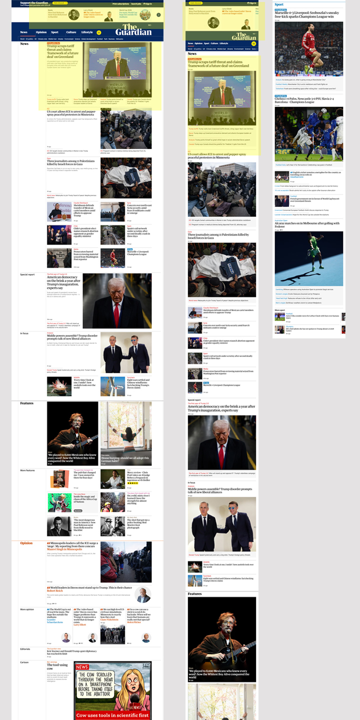
The Guardian: High-value editorial content above the masthead: interesting!
Nice packaging of related content on desktop/mobile.
Site sections: One featured story with picture, followed by five or so on a single line with or without image. Easy to review to choose something of the reader’s interest.
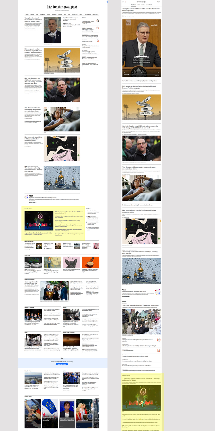
Washington Post: Top stories on desktop are single-column with head, excerpt/lead/byline; this is an unusual format for desktop, but it matches the mobile site. Again, subsections have one featured story with image, 5 or so more in single-line format.
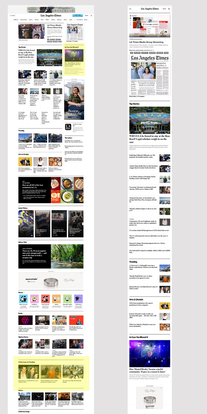
LA Times: I like having “in case you missed it” above the fold. Perhaps web staff could identify several high-value stories and it could display something the reader hasn’t already read.
“Most popular” is called “Californians are reading” which is a nice call to being rooted in the community. They also have a “Subscribers are reading” section further down the homepage.
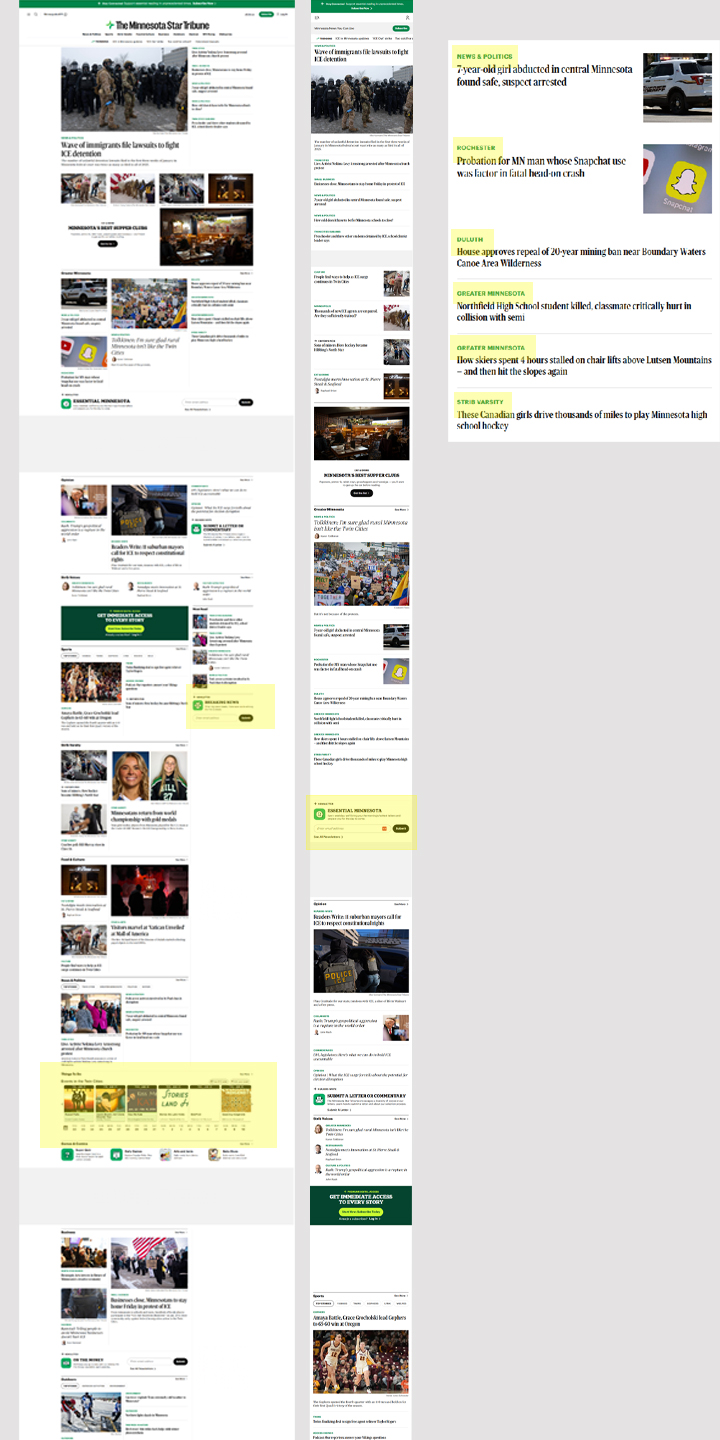
Minnesota Star-Trib: Each story has a label showing its subsection, and the label serves as navigation to the subsection. I thought this was a subtle and elegant way to allow readers to access subsections without having to sort through sub-navigation menus.
Star-Trib also has prominent newsletter sign-up boxes on the front page, which I think we should also use.
And: their event calendar is on the front page. If we’re interested in user-generated content, I think better surfacing of our existing event calendar could be an easy way to encourage reader engagement in this way. We could also have a newsletter that included events, a la the defunct Community Calendar.
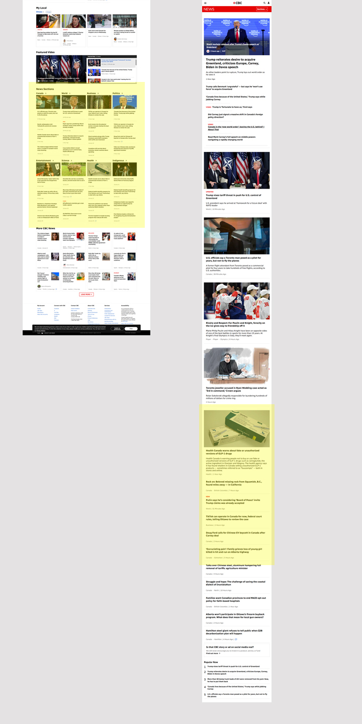
CBC: The desktop screenshot here is much lower down on the page because I find the top of CBC News’ page to be chaotic. I like the handling of subsection stories: again, one top story and multiple single-line which can be reviewed at a glance.
CBC also labels some stories with their subsection like StarTrib (but not all for some reason).
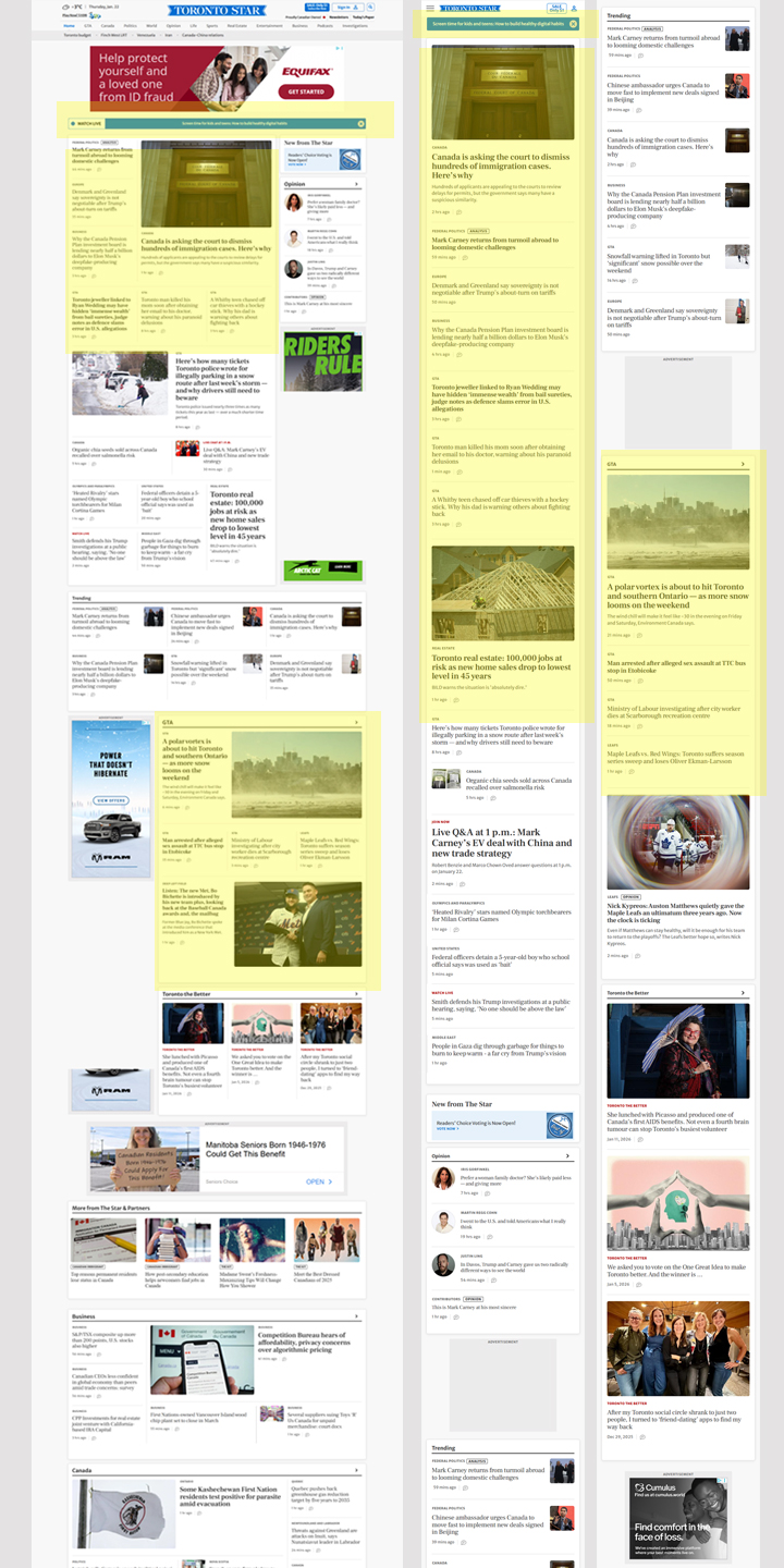
Toronto Star: Above-the-top-story one-line dismissable position for highlighting important/breaking/exclusive news item.
The Top stories appear in a block; on desktop they look to me like they should be related to each other but they are not. The Star also uses story subsection titles as navigation elements (GTA, etc). The story order on desktop and mobile don’t mirror each other the way I’d expect — there must be weighting based on whether it has a picture/except etc.
On our site, every story is in a box. On Toronto Star, each SECTION’s stories are in a box with a subtle drop shadow to indicate it’s a complete element, and individual items are separated by horizontal rules.
In subsections: one story is highlighted with image, 5-6 other stories per section without image.
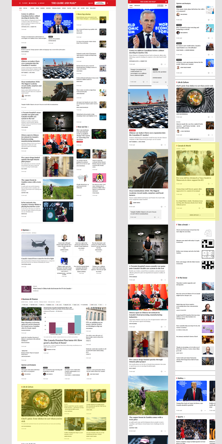
Globe and Mail: Like the Star, sections are in a box with a subtle drop shadow. Stories in a subsection are separated by horizontal rules.
Globe shows one of the most “top news” stories of site reviewed with 8 big stories and 9 others in a “more top news” rail (on desktop). On mobile, the 8 stories appear, then 3 “more top stories” that are headline only followed by a “more articles” button.
Sections in the right rail display one major story, and some show a further 1-4 headline-only stories but this appears to be optional. On mobile only there is a “More Articles” button for subsections.
-Wendy Sawatzky